· Design & Ambiance · 9 min read
Restaurant Signage and Wayfinding: Interior and Exterior Sign Strategy
Signage is often the first brand impression and the last thing operators budget properly — here is how to build a sign program that works.

A restaurant’s signage program is its silent sales team. It works 24 hours a day, communicates the brand to every passing pedestrian and driver, guides guests through the physical space, and builds the recognition that drives repeat visits. Get it right and signage functions as continuous, low-cost marketing. Get it wrong and you lose customers before they ever open the door.
The numbers make the case for investment. According to Impact Signs, 36 percent of diners are attracted to unfamiliar restaurants because of high-quality outdoor signage. Signarama’s research found that 76 percent of consumers have entered a business they never visited before based solely on its sign — and nearly 60 percent say the absence of a sign deters them from entering. These are not marginal effects. They represent the difference between a full dining room and a half-empty one.
Thinking About Signage as a System
The most effective restaurant signage programs are designed as cohesive systems rather than as individual pieces. The exterior sign, window graphics, entrance signage, menu board, restroom identification, exit marking, and any promotional displays should all feel like they belong to the same brand — using consistent typography, color palette, materials, and visual language.
This system thinking requires planning the complete sign program at the design phase, not assembling it piecemeal after opening. A restaurant that installs a premium exterior sign and then adds interior wayfinding printed at the local copy shop has undermined the brand impression the exterior sign was supposed to create.
Define the brand standards that will govern all signage — the typeface, the color values, the approved materials, the logo usage rules — and apply them uniformly. When every touchpoint speaks the same visual language, brand recognition compounds. When they contradict each other, the subconscious message to the customer is that no one is paying attention.
Exterior Signage: The Primary Brand Statement
The exterior sign is the most important piece in the program. It identifies the restaurant, communicates its positioning, and creates the first impression for every passing potential customer. According to Signarama, exterior signage should prioritize legibility, brand consistency, and visibility from the typical viewing distance — whether that is a pedestrian at 20 feet or a driver at 200 feet.
Building-mounted signs displaying the restaurant name and logo serve as the primary identification element. Dimensional letters — fabricated from metal, acrylic, or wood — create depth and shadow that read more effectively than flat printed signs, especially in varying light conditions. Premium materials like brushed metal, carved wood, or custom-fabricated dimensional letters signal a higher-end experience. The material choice is itself a communication about price point.
Monument signs are freestanding structures positioned near the road. They are particularly effective for restaurants set back from the street, in strip malls, or in suburban locations where the building-mounted sign is not visible from the primary approach angle. Monument signs should include street number visibility and, where applicable, directional arrows.
Awnings and canopies serve a dual purpose: branding surface and weather protection at the entrance. A well-designed awning with the restaurant name and color palette extends the brand impression to the sidewalk level and provides guests with shelter while waiting. The material and maintenance condition of the awning communicates brand quality — a faded, sagging awning signals neglect.
A-frame sidewalk signs are inexpensive, flexible, and highly effective for capturing foot traffic. They can be updated frequently to promote daily specials, prix fixe menus, or upcoming events, providing timely information without replacing more permanent signage.
Typography: The Non-Negotiable Rules
Readability is the foundational requirement for all signage. Impact Signs documents the standard design guidance: clear fonts, brief messaging, adequate sizing, and high contrast between text and background. But there is one specification that restaurants consistently violate: testing signage from the actual viewing distance before finalizing fabrication.
A font that looks elegant and readable on a computer screen at 16-point may become illegible as a mounted sign viewed from a moving car. Script and decorative typefaces fail at distance. Sans-serif typefaces perform best for distance reading — they maintain legibility when letter forms are small relative to viewing distance.
The 60 percent negative space rule from Impact Signs is equally important. Signs composed of at least 60 percent negative space read more clearly than those that fill every available surface with text or graphics. A cluttered sign communicates nothing effectively. A simple sign with adequate breathing room communicates its core message instantly.
Color Strategy by Concept
Color selection for signage must align with both brand identity and the psychological messaging of the concept. Impact Signs identifies the standard associations: red and yellow stimulate hunger and energy, common in fast-food and QSR branding; greens and earth tones convey freshness, suitable for farm-to-table and health concepts; deep blues and neutrals communicate sophistication for fine dining.
The key constraint is that the chosen palette must remain consistent across all signage touchpoints. A restaurant that uses navy blue and brass on the exterior sign and then installs a neon red LED sign in the window has created visual contradiction. Each element should reinforce the others.
Color contrast between text and background is a separate consideration from color strategy. White text on a dark background and dark text on a light background both provide high contrast. Medium-value text on medium-value backgrounds — even when the colors are different — loses readability in varying light conditions and at distance. Verify contrast ratios before finalizing designs.
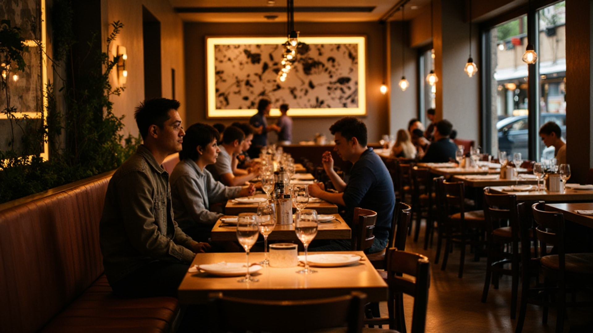
Interior Wayfinding: Guiding Guests Without Staff Intervention
Interior signage serves guests who are already inside — directing them efficiently and reducing the staff interruptions that wayfinding questions create. Clear directional signs reduce staff burden by guiding guests to restrooms, pickup counters, and private dining areas without needing to ask.
A properly designed interior wayfinding system anticipates every question a guest might have about where to go:
- Where is the host stand? (Addressed by entrance design, but signage can reinforce)
- Where are the restrooms?
- Where is the bar?
- Where is the pickup counter?
- Where is the private dining room?
- Where are the exits?
Each of these should be answered by clear, consistent signage at the decision point — the moment the guest faces a choice about which direction to go. A sign at the entrance pointing to restrooms is less useful than a sign at the corridor junction where the guest actually needs to choose.
ADA-compliant signage is required in most jurisdictions for restroom identification and exit marking. This means tactile text and Braille on restroom identification signs, mounted at the specified height, with required contrast ratios. These are not optional design elements — they are legal requirements. They also protect the comfort and dignity of guests with visual impairments, which reflects on the brand.
Menu Boards: Signage as Sales Tool
Menu boards — whether printed, hand-chalked, or digital — are simultaneously wayfinding, communication, and sales tools. They answer the primary decision question: what can I order and what does it cost?
Digital menu boards have become standard in QSR and fast-casual operations. Samsung VXT’s research identifies their primary advantages: real-time update capability, high-resolution food photography that makes dishes more appealing than text-only presentations, and dayparting functionality that automatically transitions between breakfast, lunch, and dinner menus without staff intervention.
Design requirements for effective menu boards: consistent brand typography and color palette, high-contrast text, logical organization by category, and strategic placement based on viewing distance. Boards mounted too high require neck craning; boards positioned where customers stand when ordering create decision-making bottlenecks as guests read before ordering rather than after.
At the design stage, plan for viewing distance and ambient light conditions when specifying screen size and brightness for digital boards. A screen that is readable in a dim environment may wash out in a location that receives strong afternoon sunlight.
Materials and Durability
Outdoor signage must withstand weather exposure while maintaining readability. Cast bronze, stainless steel, aluminum, and weather-grade acrylic provide the longevity required for exterior applications. Illumination through backlighting or LED elements ensures nighttime visibility — a particularly important consideration for restaurants that generate significant dinner revenue.
LED illumination has largely replaced neon and fluorescent options for illuminated signs, contributing to energy efficiency. LEDs use 60–80 percent less energy than comparable neon signs, have a lifespan of 50,000 hours or more versus 10,000–15,000 hours for neon, and maintain brightness more consistently over time.
Powder-coated aluminum and steel make simple sign designs feel premium, according to Signarama, at a lower cost than solid metal fabrication. The coating provides weather resistance and allows any color specification to be matched precisely.
Regulatory Compliance and Permitting
Local signage ordinances govern nearly every aspect of exterior signage: maximum area, height restrictions, distance from property lines, permitted illumination types, and restrictions on digital or moving content. These regulations vary significantly by municipality and even by zoning district within a municipality.
Verify all local requirements before beginning sign design. A sign designed for maximum visual impact that exceeds the permitted area or illumination type will require redesign after fabrication — an expensive mistake. The permitting process typically requires a drawing package with dimensions, materials, and installation method. Build permit application lead time (often 4–8 weeks in active markets) into your construction timeline.
ADA requirements apply to specific interior signs — restroom identification, exit signs, directional signs — and specify mounting height, tactile character requirements, and contrast ratios. These standards apply nationwide in the United States under the ADA Standards for Accessible Design.
Budget Guidance
A complete exterior signage package — building sign, monument sign, window graphics, and an awning — for a full-service restaurant typically runs $15,000 to $50,000 depending on materials, illumination type, fabrication complexity, and local installation costs. Interior wayfinding and menu board programs add $5,000 to $20,000 for a full system.
Digital menu boards, if required, add $2,000 to $5,000 per screen installed, with ongoing content management software costs of $30 to $100 per screen per month.
These are not small numbers, but the return on investment for well-designed signage is measurable in new customer acquisition. A restaurant that receives 36 percent of its new customers from outdoor signage quality — per Impact Signs’ research — is generating thousands of dollars per month from its sign program. Underfunding it to save $10,000 during construction is a poor trade.
Treat signage as a marketing investment with a quantifiable ROI, not as a construction line item to minimize.
→ Read more: Aligning Brand and Interior
→ Read more: Restaurant Entrance and Curb Appeal