· Design & Ambiance · 10 min read
Host Stand and Queue Management: Designing the Wait Experience
The wait before a meal is one of the highest-stakes moments in the guest experience — the right design turns it from a liability into an asset.
The minutes between arrival and seating are some of the most emotionally loaded in the entire restaurant experience. Guests who’ve been looking forward to a meal arrive with excitement that’s fragile — waiting tests it. How they’re received, where they wait, how long they wait, and what they experience during that wait will shape their entire perception of the meal that follows.
Toast’s research on restaurant host stands and waiting areas frames it well: the waiting area has evolved from functional necessity to a strategic element of the guest experience. That shift in thinking, from a problem to be managed to an opportunity to be designed, is the starting point for getting this right.
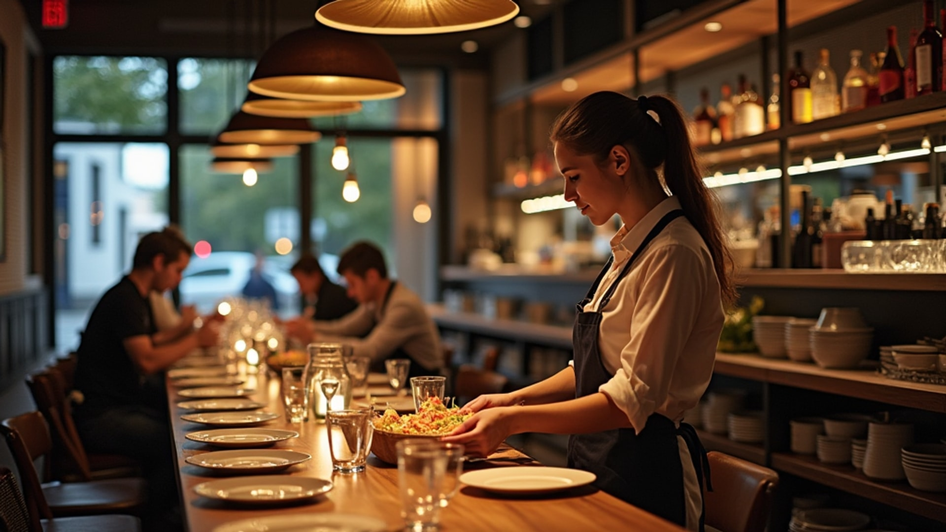
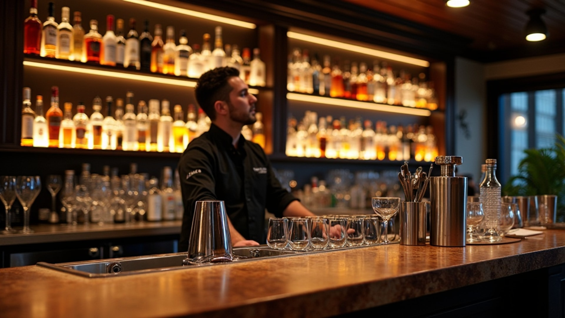
The Host Stand: First Interior Impression
The host stand is the first interior surface your guests encounter, and its design communicates everything: how organized you are, what price point you’re operating at, how prepared you are for their arrival. Aaron Allen & Associates, in their analysis of common restaurant design mistakes, are blunt about the consequences of getting this wrong: cluttered host stations make poor first impressions.
What should a well-designed host stand contain? Exactly what’s needed for its operational function, and nothing more:
- The reservation and waitlist management interface (usually a tablet or compact terminal)
- Current menus for the service period
- A small amount of working space for the host to organize the floor
- Concealed storage for operational items that need to be at hand but not visible
What it should not contain: staff personal items, yesterday’s reservation printouts, promotional materials stuffed into corners, charge cables trailing across the surface, or anything that signals disorganization to an arriving guest.
The physical design of the stand matters as much as what’s on it. It should be scaled appropriately for the space — not so massive it dominates the entrance, not so small it looks improvised. It should be positioned to allow the host clear sightlines to both the entrance door and the dining room. The host needs to see guests arriving and to monitor table status simultaneously.
The aesthetic of the stand should match the restaurant’s overall design language. A polished wood and metal stand in a rustic concept, or a cold industrial steel structure in a warm, organic-feeling space, communicates the same dissonance as any other brand inconsistency. The host stand is in many ways the physical embodiment of the restaurant’s brand at the moment of first contact.
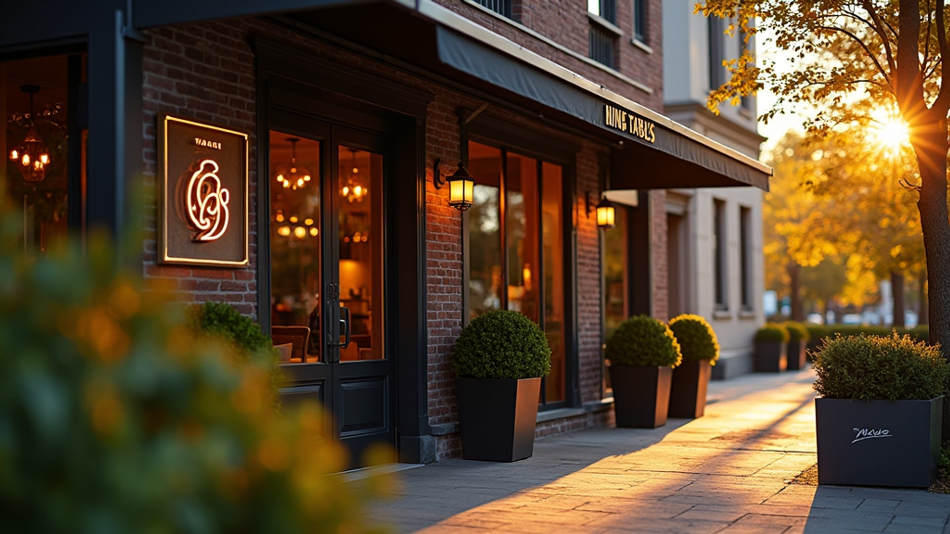
The Entry Vestibule: The Transition Space
Most restaurants have some version of a transitional zone between the exterior entrance and the host stand — a buffer that serves weather protection, thermal insulation, and psychological transition functions. Approximately 50 square feet between exterior and interior doors is the common standard for this entry vestibule.
Fifty square feet is roughly a 7 by 7 foot space — modest but functional when designed well. This space needs to:
- Provide weather protection so guests can close an umbrella, shake off rain, or adjust a coat before proceeding
- Allow a couple to enter simultaneously without blocking the door behind them
- Contain any ADA-required maneuvering clearances at the door
- Project the restaurant’s character from the first second of interior experience
The vestibule is often neglected in design budgets, treated as a functional transition rather than an opportunity. But this is the first impression of the interior, before guests even reach the host stand. The light quality, the flooring material, the ceiling height, and any brand element encountered here set the emotional register for everything that follows.
If your restaurant regularly experiences waits, the vestibule may also need to absorb some of that overflow — which argues for treating it as the beginning of the waiting experience, not just a transition zone.
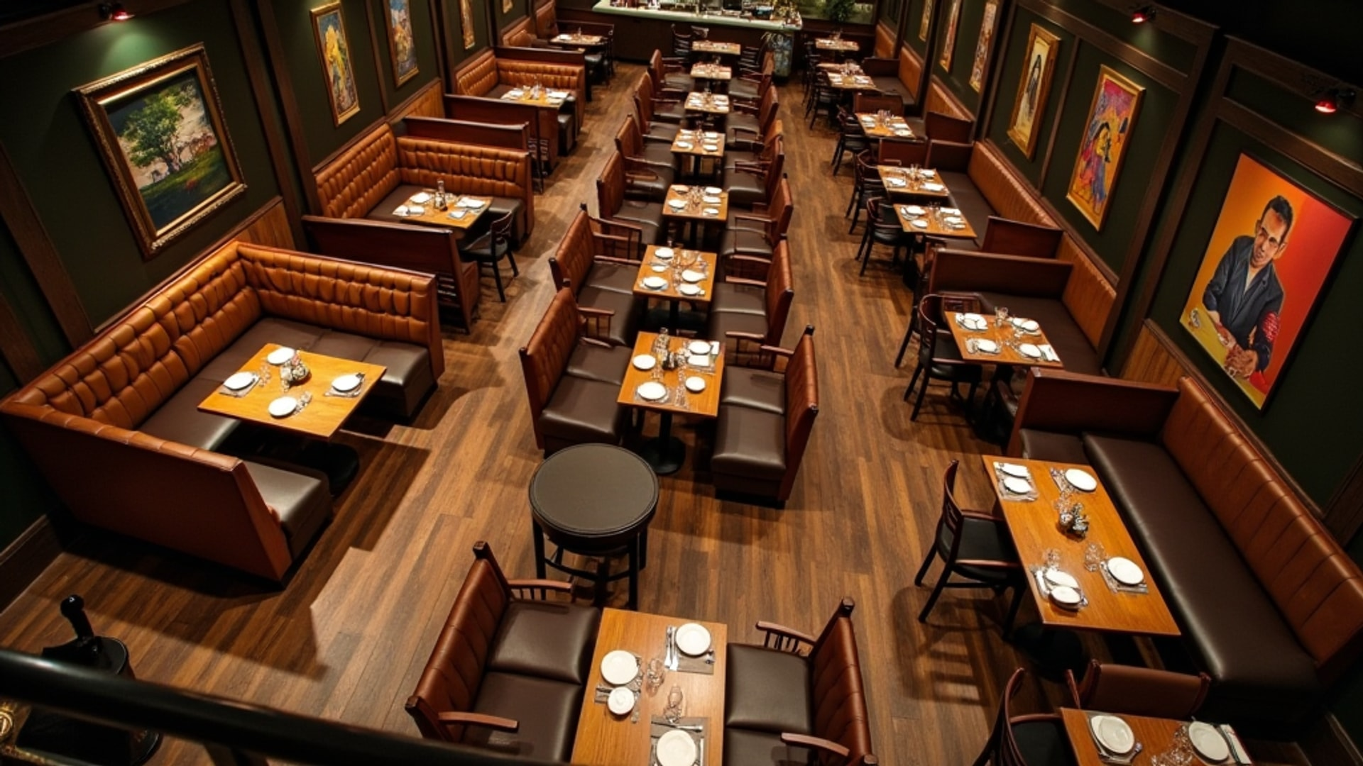
Waiting Area Design: Balancing Capacity and Comfort
The waiting area proper is where queue management design becomes most consequential. Too little space creates gridlock. Too much and it looks perpetually empty, which reads as failure. Insufficient waiting space creates gridlock that makes navigation difficult for staff and customers alike.
The capacity calculation starts with realistic peak wait times and party volumes. A restaurant that regularly seats parties of two to four with 20-minute waits needs waiting space for perhaps eight to twelve guests at any given time. A larger restaurant with 45-minute waits on Friday nights needs space for significantly more — and needs to design that space so it doesn’t feel like a DMV waiting room.
Seating Options
Varied seating works best: two-person settees, communal benches, and formats that accommodate different party sizes. The reasoning is practical: a couple waiting doesn’t want to sit on a long communal bench designed for eight. A family of five waiting needs seating that keeps them together.
The seating mix should reflect the typical party composition of your guest profile. If you primarily serve couples, bias toward two-seat arrangements. If you’re a family-friendly concept, include bench seating that accommodates groups. If you have a strong bar culture, standing-height ledges or counters at the bar perimeter can provide waiting space that doubles as bar access.
Seating comfort during the wait is a direct investment in table experience. Guests who’ve been standing uncomfortably for 25 minutes arrive at the table already fatigued. Guests who’ve had a comfortable seat and a drink in their hand arrive ready to enjoy themselves. The correlation between waiting area comfort and table spend is direct and measurable.
Sight Lines to the Host Stand
The visual connection between waiting area and host stand is critical: guests should be able to see the host and vice versa, preventing the common frustration of feeling overlooked or forgotten.
This is a basic design requirement that gets violated surprisingly often. When the waiting area is around a corner, down a corridor, or in a bar that’s separated from the host stand by walls or distance, guests lose visual contact with the person managing their wait. Even if the host is actively tracking them, the guest experience is of being forgotten. The anxiety of waiting rises in direct proportion to uncertainty about whether anyone knows you’re there.
The design solution is either a physical arrangement that maintains sightlines, or a technology solution (pager systems, text notifications) that gives guests confidence they haven’t been lost in the queue. Both can work. Neither is optional.
Separating Dine-In from Takeout Traffic
The explosion of off-premise ordering — takeout, delivery pickup, third-party fulfillment — has created a logistical challenge that many restaurant spaces weren’t designed to handle. Dine-in guests and takeout customers flowing through the same space at the same host stand create congestion, confusion, and negative experiences for both groups.
The solution is clear: delineated spaces should separate dine-in waiting from takeout pickup to prevent congestion. This separation can be physical — a dedicated pickup counter or window away from the host stand — or it can be managed through clear signage and distinct processes.
The specific design depends on volume. A restaurant doing modest takeout volume can handle it at the host stand with clear signage and a defined pickup shelf. A restaurant doing high pickup volume — particularly one that added third-party delivery during the post-2020 period and never rolled it back — needs a dedicated pickup point that keeps delivery drivers and pickup customers entirely separate from the dining guest arrival flow.
Getting this separation wrong creates the worst of both outcomes: dine-in guests feel like they’re walking through a delivery operation, and takeout customers face delays because the host is managing tables.
Technology Integration in Queue Management
Modern queue management technology has transformed the waiting experience when implemented well. Modern waitlist software can quote wait times, send text notifications when tables are ready, and allow guests to wait off-premises, reducing crowding in the physical waiting area.
The value of allowing guests to wait off-premises cannot be overstated. A guest who’s been told their table will be ready in 35 minutes and who receives a text notification when it’s actually ready has a fundamentally different — and better — waiting experience than a guest standing in your vestibule watching the clock. They can walk next door for a drink, stay in their car, or wait anywhere they’re comfortable. They return to the restaurant already happy rather than fraying.
The technology options range from simple free tools to sophisticated reservation and queue management platforms with analytics and two-way communication. The right choice depends on volume and complexity. A neighborhood restaurant with occasional waits can manage with a basic waitlist app. A high-volume destination restaurant benefits from a full reservation management platform that integrates waitlists, reservations, table management, and guest communication.
The one non-negotiable: whatever system is in use, wait time estimates must be accurate. An inaccurate 20-minute estimate that becomes a 45-minute wait damages trust and starts the meal on a sour note. Better to quote 40 minutes and seat guests in 35 than to quote 20 and deliver 45.
Engaging Guests During the Wait
The waiting area should not be a neutral space where guests stand or sit with nothing to engage them. Several approaches turn the wait into the beginning of the dining experience:
Menu displays and daily specials engage waiting guests and prime them for ordering decisions that will speed table service. A guest who’s read the menu and made a tentative selection during the wait is ready to order within minutes of sitting down. This meaningfully reduces time-to-order, which increases table turns without making guests feel rushed.
Digital displays showing imagery of the food, the kitchen, the sourcing story, or the broader brand content serve the same engagement function while allowing easy updating without reprinting.
Drink and snack service in the waiting area — a glass of wine, a small amuse-bouche, a complimentary bread bite — transforms the wait from a cost into a service gesture. Guests who’ve been served something during the wait arrive at the table in a hospitality frame rather than a customer-service frame.
Branded merchandise or retail in the waiting area creates a browsing opportunity that passes time while generating an additional revenue stream. Cookbooks, branded pantry items, or gift cards can all find appropriate homes in a well-designed waiting area.
Accessibility in the Waiting Space
Accessibility is a priority in modern restaurant waiting area design. Inclusive design serves universal comfort. The practical requirements include:
- Clear 36-inch minimum floor space for wheelchair maneuvering throughout the waiting area
- At least some seating at heights accessible to wheelchair users
- Clear path from entrance through waiting area to the host stand without obstacles
- Accessible checkout counter or host stand surface at 28 to 34 inches for guests in wheelchairs
Accessible waiting design is both a legal requirement and a business case. The ADA requires accessible design in public accommodations, and the business consequences of inadequate accessibility extend beyond legal compliance: a party that can’t be comfortably accommodated during the wait may leave, taking multiple guests’ revenue with them.
The Wait as Brand Communication
The entire waiting experience — the design of the space, the host’s greeting, the accuracy of the time estimate, the comfort of the seating, the engagement during the wait — communicates your restaurant’s values before a single dish is served.
A restaurant that treats the wait as a genuine hospitality opportunity, not a logistical burden, wins the trust and goodwill of its guests before they sit down. A restaurant where the wait is uncomfortable, disorganized, and uninforming has already created a negative baseline that the food and service must overcome. Most don’t fully recover.
Design the wait. It’s part of the meal.
→ Read more: Bar Design, Waiting Areas, and Guest Flow
→ Read more: Restaurant Entrance and Curb Appeal